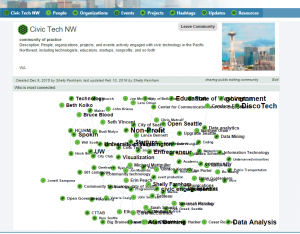
Network visualizations are a risky feature to add to community tool. While they can provide a good overview of a community and its connections, they require some training to interpret, so are often not well received by every day users.
Still — we wanted to explore the option, so were inspired to hunker down and add a network visualization to the Spokin community page — attached is a screenshot showing the 100 most connected entities for the civic tech NW network, using D3.

